As the business world becomes ever more complex (and less and less forgiving), the ability to show data in a meaningful way—without overwhelming people or leading them to the wrong conclusions—has become a foundational skill for all leaders. The good news is there are lots of tips and tricks you can use to create easy-to-understand, high-impact dashboards. Here, are 9 Do’s and Don'ts to keep in mind:
DO experiment, iterate and most importantly, get feedback. You'll be amazed what happens when you show your work to somebody who hasn't lived with the dashboard as long as you have.
Do you think all the dashboards that made it into the book “got it right” the first time? So many of the dashboards had to endure an “extreme vetting process” where we would ask, “Why are those bars red? Why is that text over there? What happens if you move that important component from the bottom right—where I didn't even see it—to the upper left?”
Getting feedback early also turns passive participants into project owners who will want to see the project succeed.
DON'T emulate snazzy infographics from Time and USA Today to garner user engagement. Your organizational dashboard probably isn't appearing in a magazine or public website where it must compete with pictures of kittens and puppies. If you really want to engage your audience, you should personalize the dashboard for each viewer (people like things that are about themselves even more than kittens and puppies). It's easier to do than you might think.
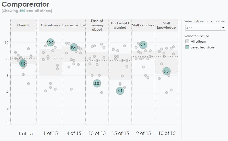
DO make it personal. You want to create things that are meaningful to the people viewing them, and one of the best ways to do that is to include the viewer in the visualization. You can do this by creating dashboards that make it easy for people to see how their department, region, store, etc., is doing with respect to others (see below).

DO mix and match the best elements from different dashboards and from different industries. Yes, each industry has its own challenges, and you want to be inspired by solutions you can relate to, but you'll be missing great stuff if you don't look beyond your silo. One of the best examples is a mobile-ready dashboard that professional soccer players use to see how well they performed across different measures.
The technique to show the most recent match compared with previous matches is jaw-droppingly effective and will work in any situation where you need to compare current with past performance.
DON'T use red and green. At least don't use the hues of red and green that you usually see in things like balanced scorecards as a startlingly large percentage of the population cannot discern any differences between those two colors! If you know a little bit about the general population and color-vision deficiency (a.k.a., "color blindness"), you'll make things that more people can use and that will likely be considerably more attractive than a traffic light.
DON'T try to answer every question in one dashboard. We have yet to hear anyone say, “This dashboard would be better if you overstuffed it with even more information.” By all means, answer the most important questions (at least the ones you know about) but expect your work to generate as many new questions as it answers! It's the first step in building an open, data-driven company as it encourages individuals to explore data on their own, discover new insights, and then publish their own dashboards.
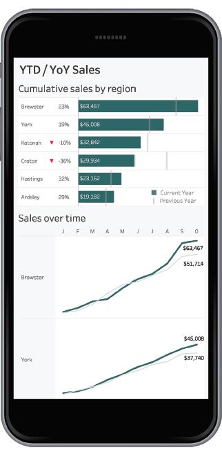
DO design with mobile devices in mind. You want to make it as easy as possible for people to explore the information they need, when they need it, and that means creating dashboards that are mobile-friendly.

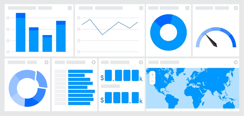
DO use BANs (big-ass numbers) on your dashboards. These are large, key performance indicators that start as anchor points to the dashboard. They can serve as conversation starters and finishers, can provide context to adjacent charts, and can serve as a universal color legend. They are also wonderful anchor points for people who may be unfamiliar with a dashboard as they practically scream, "Start here!"

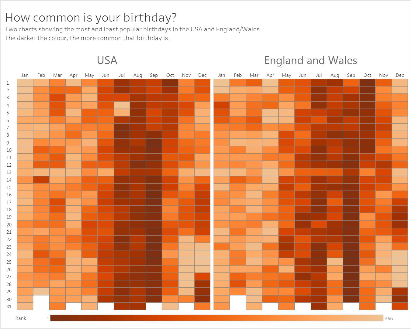
DON'T use the same old chart for your data. You've got a dataset that has time in it. Don't assume a line chart will be the best choice. There are many ways of visualizing time. Some will reveal insights the standard timeline cannot show. If you're looking at seasonality, or changes in rank, or part-to-whole changes over time, the timeline is sometimes the worst choice. Consider the question being asked of the data, then iterate through the different chart types to find the most appropriate.

Steve Wexler, Jeffrey A. Shaffer and Andy Cotgreave are coauthors of The Big Book of Dashboards: Visualizing Your Data Using Real-World Business Scenarios. Steve Wexler has worked with organizations worldwide to help them understand and visualize their data. (To learn more, visit DataRevelations.com.) Jeffrey A. Shaffer is vice president of information technology and analytics at Recovery Decision Science and Unifund. (To learn more, visit DataPlusScience.com.) Andy Cotgreave is technical evangelist at Tableau Software with over 10 years' experience in data visualization and business intelligence. (To learn more, visit GravyAnecdote.com.)

